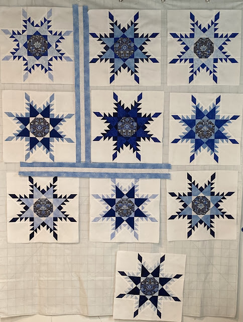
Eight feathered stars have been pieced for Blue Radiance. I need 9 blocks for the wall quilt, I've pieced two more stars.
These blocks are all starting to look alike! And the second block.
I pieced a tenth block because I can't decide if I like the dark block in the center or not. What do you guys think?
Here are the blocks with the dark star in the center.
Here are the blocks with a a different star in the center.
I sewed some sashing to help in the decision. What do you think?
This next picture has the dark block in the center.
I think I like it better without the dark block in the center but I'm not 100% sure yet.
The pattern for Radiant Blue(s) is found in the January/February 2007 issue of Fons & Porter's Love of Quilting magazine and is designed by Marsha McCloskey. I didn't use Marsha's directions to piece the stars, I foundation paper pieced them using the 16" pattern found here at Threaded Quilting Studio.
Linking to Midweek Makers, Wednesday Wait Loss, Needle & Thread Thursday, Put Your Foot Down, TGIFF!, Finished or Not Friday, Off the Wall Friday, Beauty Pageant, Patchwork & Quilts


Hey Gretchen these are such lovely blocks! All of them... Maybe you could make a cushion with the remaining block! Or add it to the back but I would hate for your precise piecing to get not shown with this wall quilt or near.
ReplyDeleteThat said I too like the dark one with that sashing... thanks for sharing this and for giving us a chance to have a say about YOUR design! lol
Kathi
They're looking beautiful, Gretchen!!! I like the block on the top center row for the very center block--that's the one that stands out to my eyes. I like that you made 10 blocks, so you have options!
ReplyDeleteI'm no good with advising, because I love every single block!! I think they are just beautiful - together with our without sashing. The blues against the white - it is just eye candy for me.
ReplyDeleteIt's beautiful either way, but I vote for the lighter block.
ReplyDeleteThis quilt is going to be a stunner! I'll agree with you and vote that I like the lighter star better than the darker one. You need a star tote bag, right?!? Have a great day.
ReplyDeleteI think I like it better with the dark not in the center also - good job on those blocks - that one always gives me trouble
ReplyDeleteI think the dark block should be the center. Every quilt needs a focal point and that gives you one right in the center to draw you into the quilt. Your blues are beautiful.
ReplyDeletei like the dark block in the middle as well otherwise the top row middle one looks dark...and i like the sashing too....very nice indeed...drooling here
ReplyDeleteThey are all gorgeous blocks. I think I'd take the block you like best for the middle. I think every layout looks good so just put your favorite block in the 'star' position. ~Jeanne
ReplyDeleteI'd trust your instinct and remove the dark star. We always know what's best but don't often trust our feelings! I so love this project. It's going to be so pretty. Thanks for sharing on my weekly show and tell, Wednesday Wait Loss.
ReplyDeletehttps://www.inquiringquilter.com/questions/2024/05/15/wednesday-wait-loss-380
Your blocks are looking amazing, Gretchen! I look forward to seeing how you decide to lay them out. This is going to be another beauty.
ReplyDeleteLooking great but I do prefer it without the darker block. xx
ReplyDeleteThat pattern, torn out of the magazine, has been in my someday-I'll-tackle-this stack. Your stars are beautiful! Sorry that I cannot provide advice on keep or leave that one block.
ReplyDeleteIf you use the light blue sashing it will allow the dark to remain in the Center. Without the sashings, it doesn’t blend well.
ReplyDeleteBUT you have done a beautiful job on the blocks - all are beautiful!!!! I want to make another one, but you know me I do not paper piece! LOL. Hugs and happy decision making.
The dark block does not have enough contrast with the points ringing it, that makes it stand out as odd. So I would use the other block in the quilt. As far as which one is in the center, I would move the brighter blue block into the center since it's the only one with that brighter hue. But they are all lovely blocks!!
ReplyDeleteEither block works well…it just depends on the look you are going for. These blocks are gorgeous! You do have a way of making interesting variations of the stars with placement of the various shades of blue in each block. The sashing is perfect! Gail at the cozy quilter.
ReplyDeletehmm its a hard decision........maybe if you don't use the dark one in the centre you use the dark one in the middle tp row for the centre???
ReplyDeletethe blocks look great.....looking forward to seeing it come together now.......
Pretty stars! I would say, go with your first impression. The darkest star doesn't show the details of the center very well, and I love the corner variation you made on the last 3 blocks. Maybe the darkest star remaining (the one from the top row) can take the center spot?
ReplyDeleteWhatever you choose, this quilt will be beautiful!
Thank you so much for sharing.
The blocks are looking fabulous, Gretchen. I look forward to seeing what you decide on the darker block. Happy Quilting.
ReplyDeleteYour blocks are so lovely. I have a feathered star design in the works (2 years now) that I will finish and make. Until then, I'll envy yours. Thank you for linking up to Put your foot down.
ReplyDelete